Thursday, 20 December 2012
'The Outcast' Typography
Here I used the same font 'vani' as I did for escape. I changed the bottom word to red to fit in with the blood and horror theme. For this I have just used the brush tool and added different blood splatter effects in the same colour, in some places layering them to create different effects. I like how this has finished as it was really easy to achieve but look affective and conveys the idea of horror and gore.
'Escape' Typography
I started with the title 'escape', I have made it a red colour and placed black cracks on the copy (using the brush tool) as though it is old and worn.
Here I used the sponge tool to make the lower half of the copy a darker colour (fading out)
Here is the final copy.
Wednesday, 12 December 2012
Poster Title Ideas
Poster Titles;
- Terror
- The Alone
- The Unattended
- The Deserted
- The Outcast - The Outcasts (are you the outcast?)
- Escape (there is no escape)
- (female name) Persephone - "to kill"
Questionnaire
I've used an online questionnaire site to try out mine and see how the feedback goes.
http://www.surveymonkey.com/s/RCJVW5P
http://www.surveymonkey.com/s/RCJVW5P
Saturday, 8 December 2012
Photo Manipulation 2
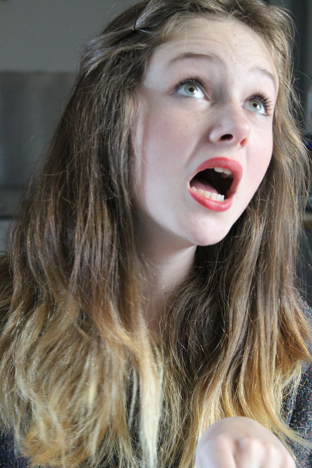
These are the two original photographs I have taken, the girl looks a little sarcastic so hopefully I could get a more realistic 'screaming' look next time. These woods are local near me and look very isolated and creepy.
I layered the photographs and changed the opacity to 50, to look like this.
The end image gives a hint towards character and setting.
Friday, 7 December 2012
Photo Manipulation
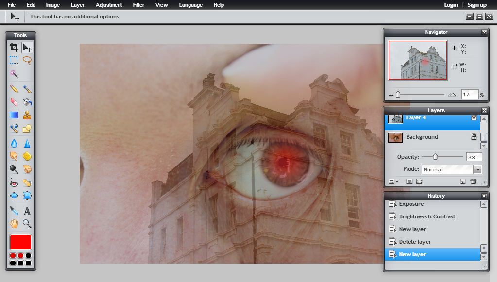
Here I took three images I have taken; My dad's eye which looks outstretched almost looking painful, to give a striking effect. A photo of my friend (using the studio), I liked this photo as she looks almost anonymous as you cannot see her face. The building was one in Hastings but when put with a background so blank it looks quite foreboding.
I then changed the image by adjusting the 'brightness and contrast' and 'colour vibrance'.
I then layered the building on top and changed the layers opacity. Giving it an eerie effect. This is my favorite as it looks more eerie.
I still need to bleed the images out more as this is still an image not a poster.
I then made the building stand out more and cropped the image to A4. I don't like how the image started to change from here on, the eye was no longer as red and I wanted the building to stand out more but the effect I used didn't work like I would have liked.
Afterwards I layered the image of the girl onto the eye, as the seeing a reflection/through the subjects eyes. Next time I should maybe edit the photos individually and then put them together instead of layering them and then editing them.
The final image.
Monday, 3 December 2012
Subscribe to:
Comments (Atom)


